

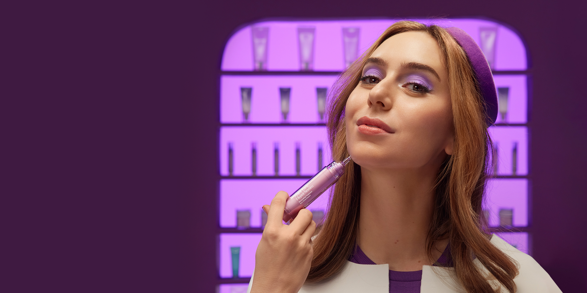


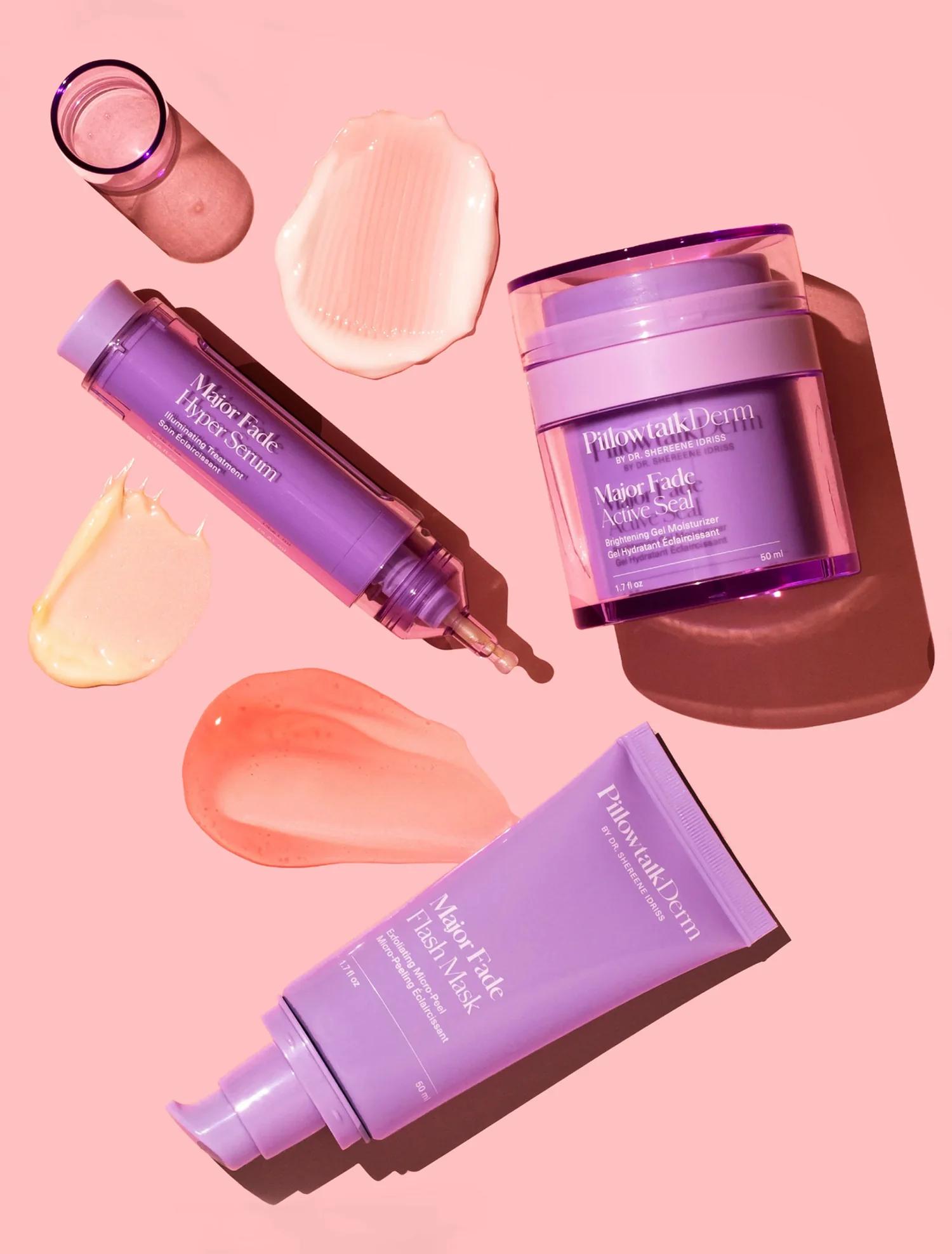
Pillowtalkderm
Pillowtalkderm refreshed their branding and contacted us to redesign their website to reflect their new look. They wanted a custom, modular, and scalable website that is easy to maintain and offers faster performance compared to their previous theme.
Drag
Not only did we enhance the website's from a the user experience perspective, but we also optimized maintenance for the client. We introduced modular elements that work consistently and can be used across the whole website. Dynamic content components can be implemented on all pages making it really easy to maintain a cohesive look.
PillowtalkDerm prides themselves in being science backed and fact based. There is so much information that was getting lost in accordions on their previous product page. There was a lack of clear hierarchy, and essential elements were not highlighted. To accommodate all this content they were using plugins that were not easily edited and affecting page speed.
We focused our attention on creating an experience that makes information really easy to consume and find. Essential information isn't simply listed in tables and accordions rather extracted and packaged in a modular and beautiful design. Utilizing custom code instead of depending on plugins means there's no limit on content and no compromise on performance or editing experience. We also optimized the shopping experience by adding new elements like a sticky "add to cart" button and moving the recommended products above the fold.
One of PillowtalkDerm's biggest goals was to improve page speed. We managed to increase the performance on mobile by 70% and on desktop by 25%. We did this without having to compromise on existing content or functionally while also adding new requirements. We optimised images, kept the code light and avoided working with plugins wherever it was possible.
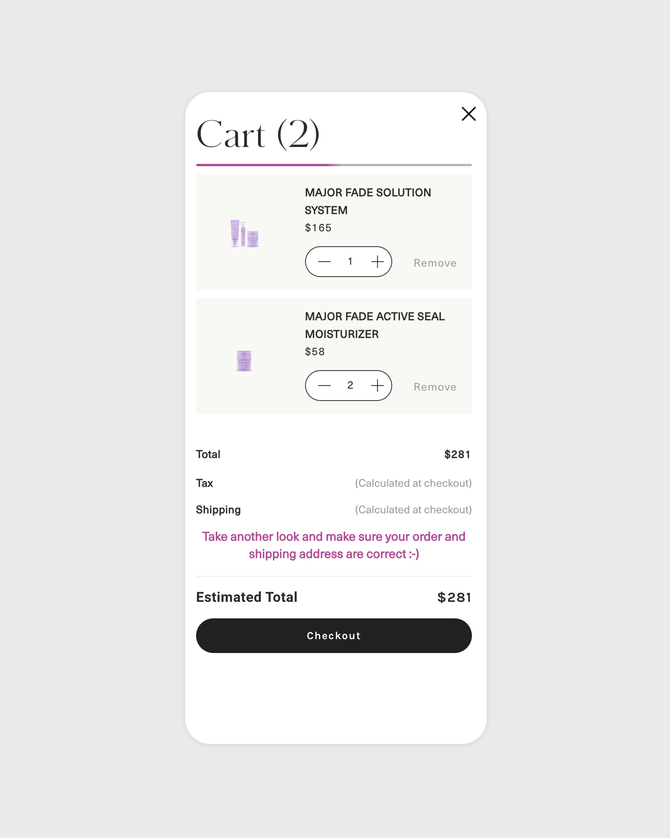
The old shopping cart had elements in it that weren't needed and used up space. Additionally, the banner at the top wasn't clearly labeled, which meant users had no idea they would be benefiting from adding more items to their cart.
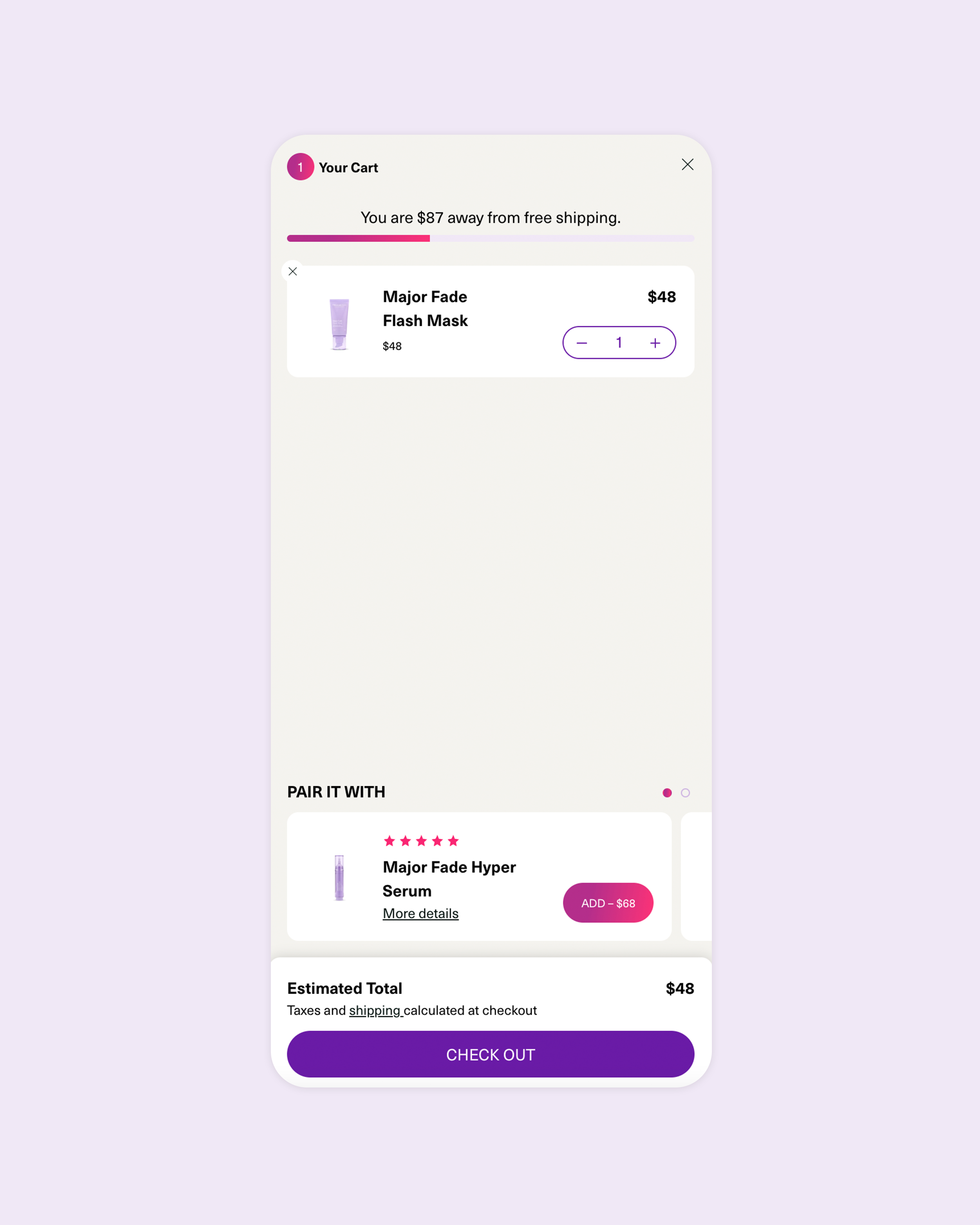
We removed elements that were not needed and added product upsells to the cart to fill the space with valuable content. We made the product cards smaller so you can see more without scrolling down. Furthermore, we introduced a distinct hierarchy of information to enhance clarity.

The previous search starts empty until you start typing something in, this is a missed opportunity to make this experience faster and more interactive. The product cards are big, which means you have to scroll to see more than one item.
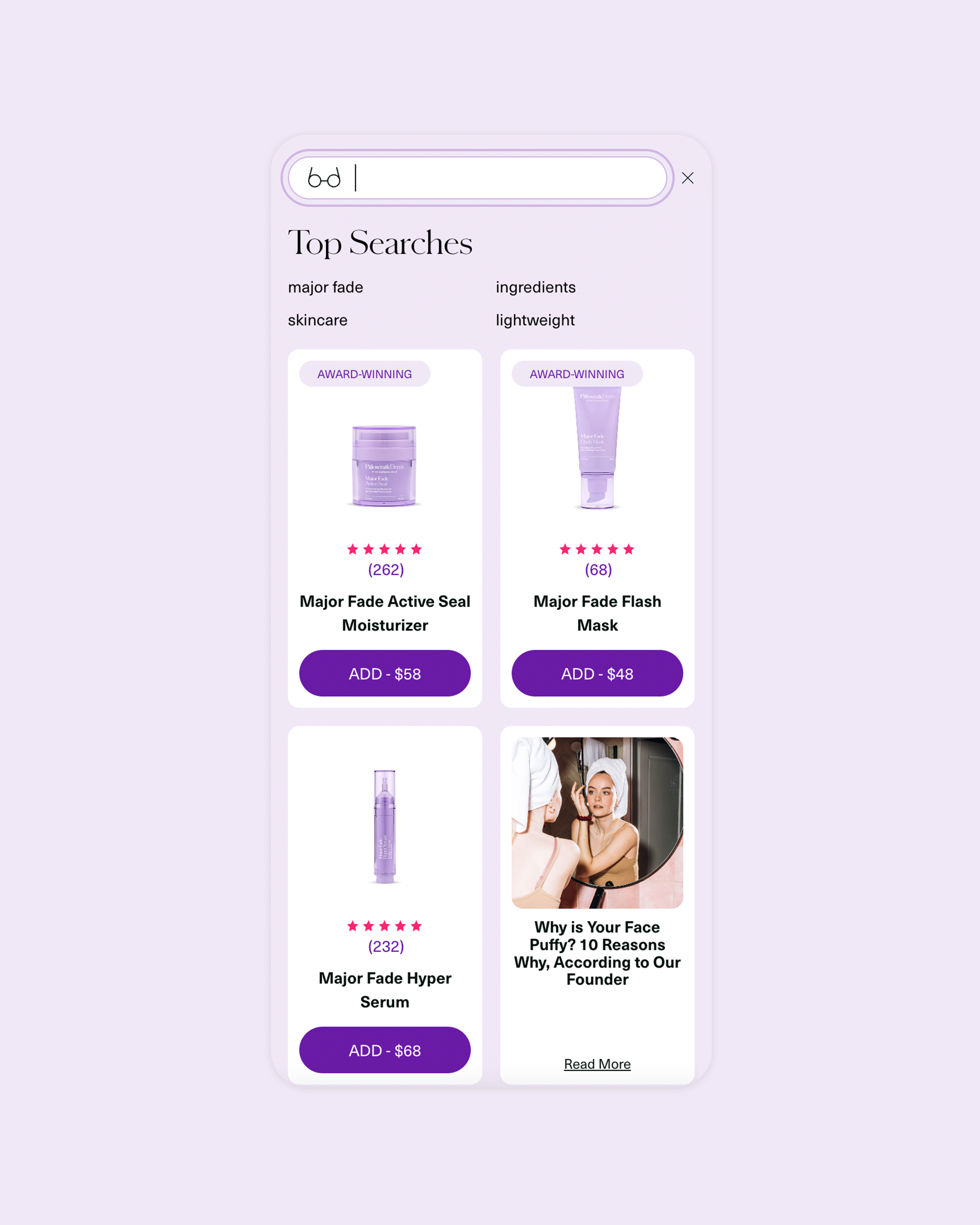
Now, before the user even searches they are presented with popular search terms, recommended products and blog articles. We kept the product cards small so that more of them can fit on the screen without the need to scroll.
The old shopping cart had elements in it that weren't needed and used up space. Additionally, the banner at the top wasn't clearly labeled, which meant users had no idea they would be benefiting from adding more items to their cart.
We removed elements that were not needed and added product upsells to the cart to fill the space with valuable content. We made the product cards smaller so you can see more without scrolling down. Furthermore, we introduced a distinct hierarchy of information to enhance clarity.
The previous search starts empty until you start typing something in, this is a missed opportunity to make this experience faster and more interactive. The product cards are big, which means you have to scroll to see more than one item.
Now, before the user even searches they are presented with popular search terms, recommended products and blog articles. We kept the product cards small so that more of them can fit on the screen without the need to scroll.


Shopify
Figma
Notion
Diep Le
Web Design
Daniel Maslan
Development
Katharina Chalupsky
Development
Rebecca Russell
Creative Direction
Management
Rebecca Balogh
Management


We use cookies so that you have a better experience, you can read more in our cookie policy.