Kylie Cosmetics

Design

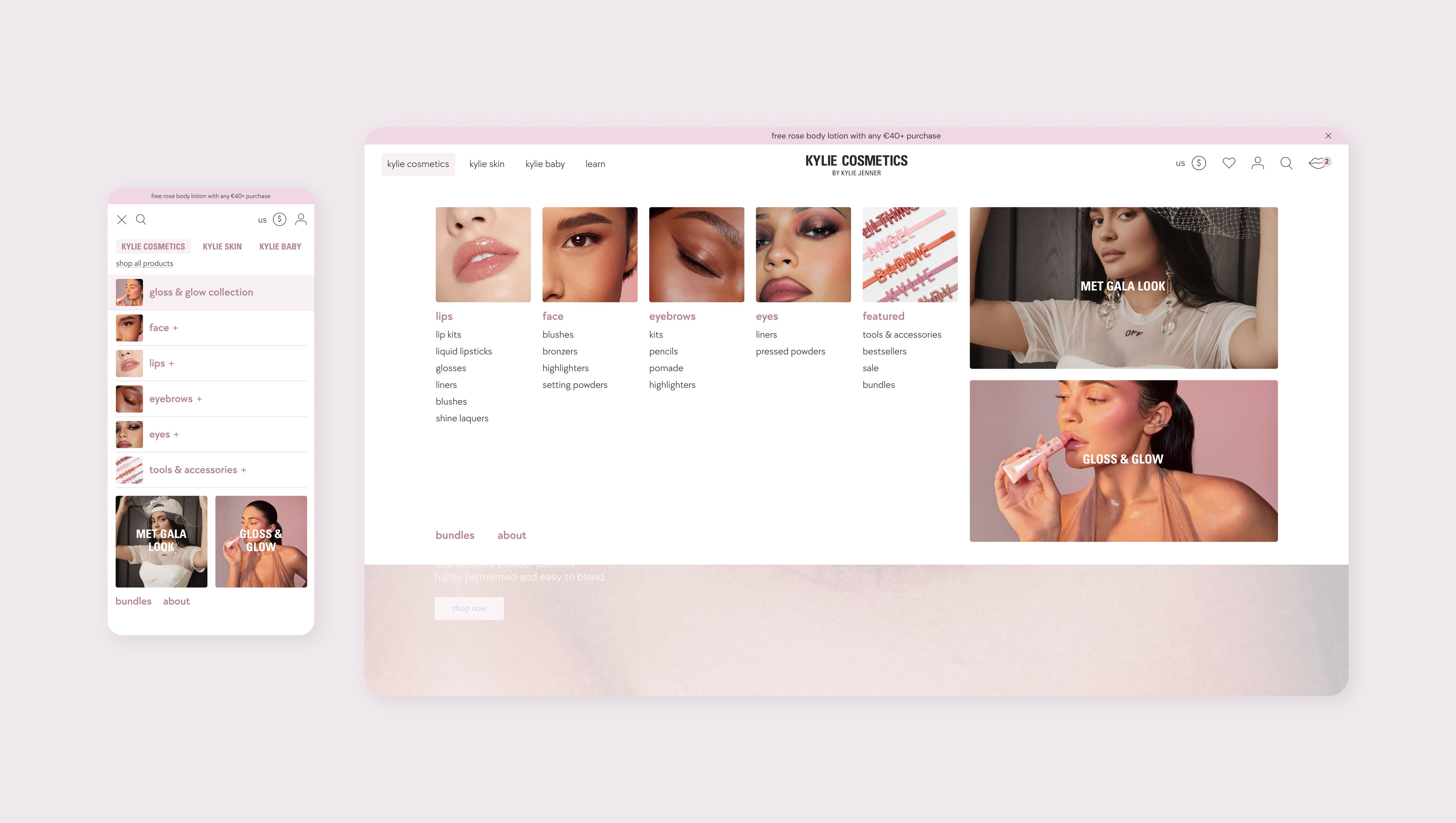
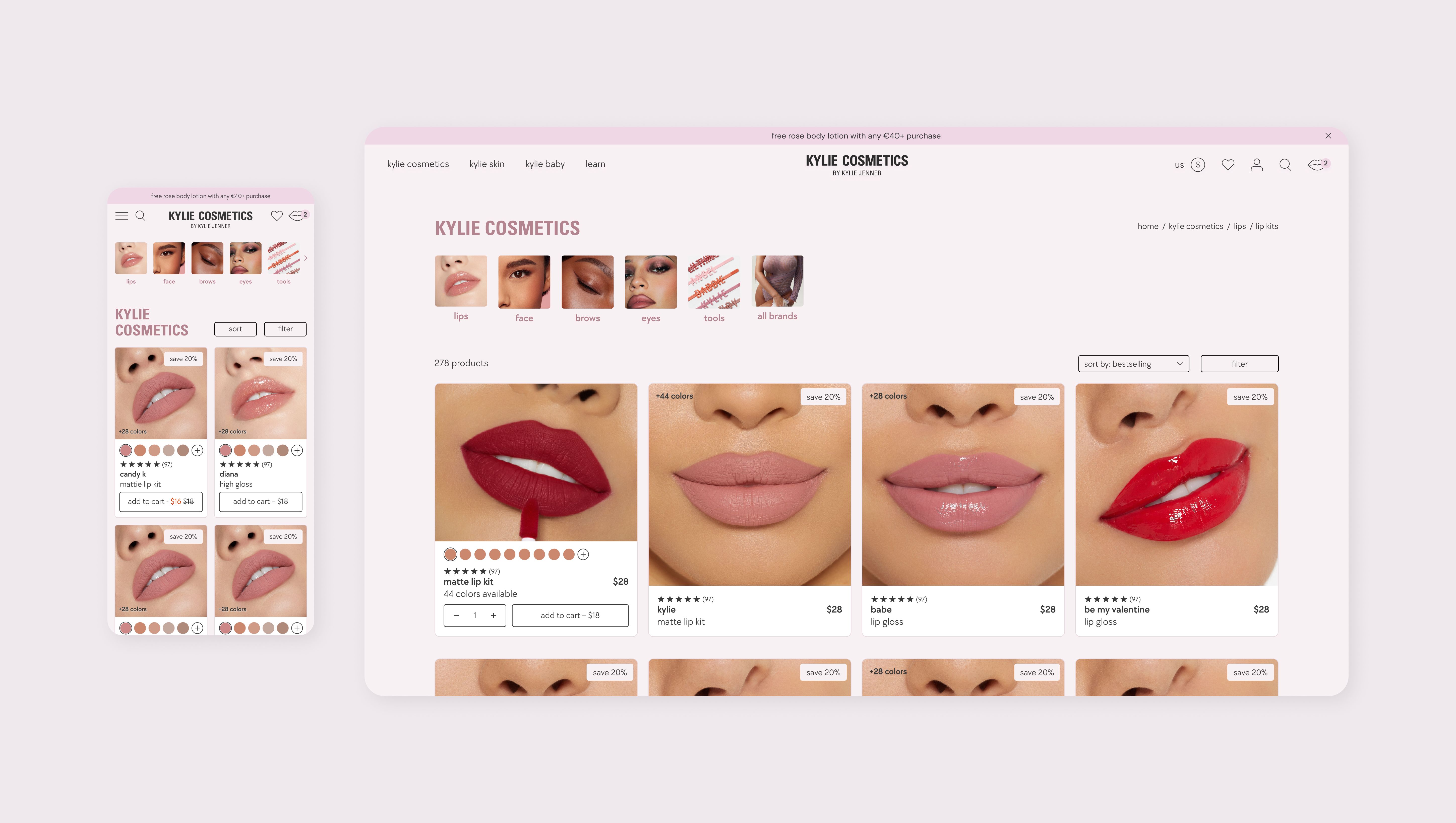
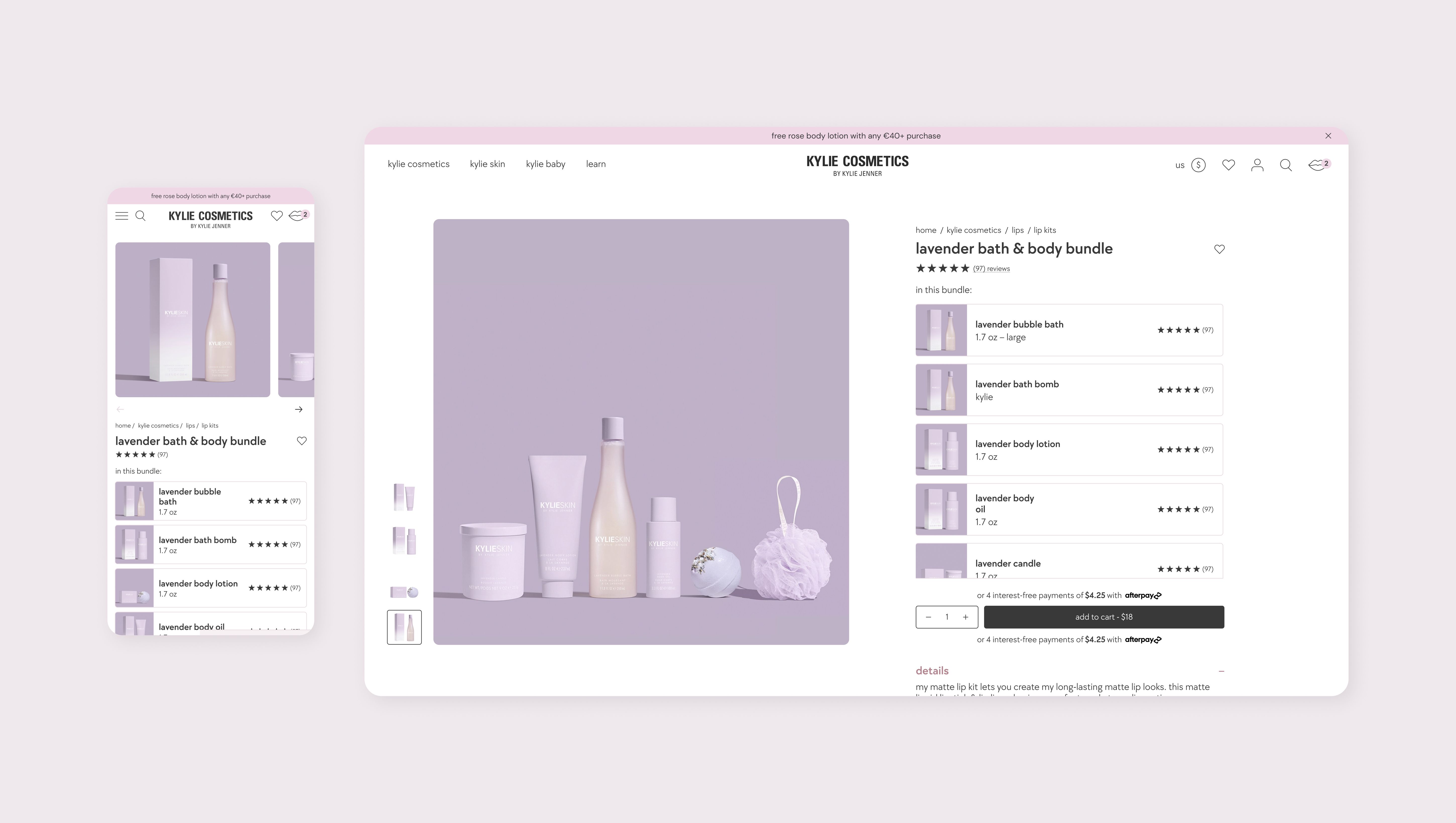
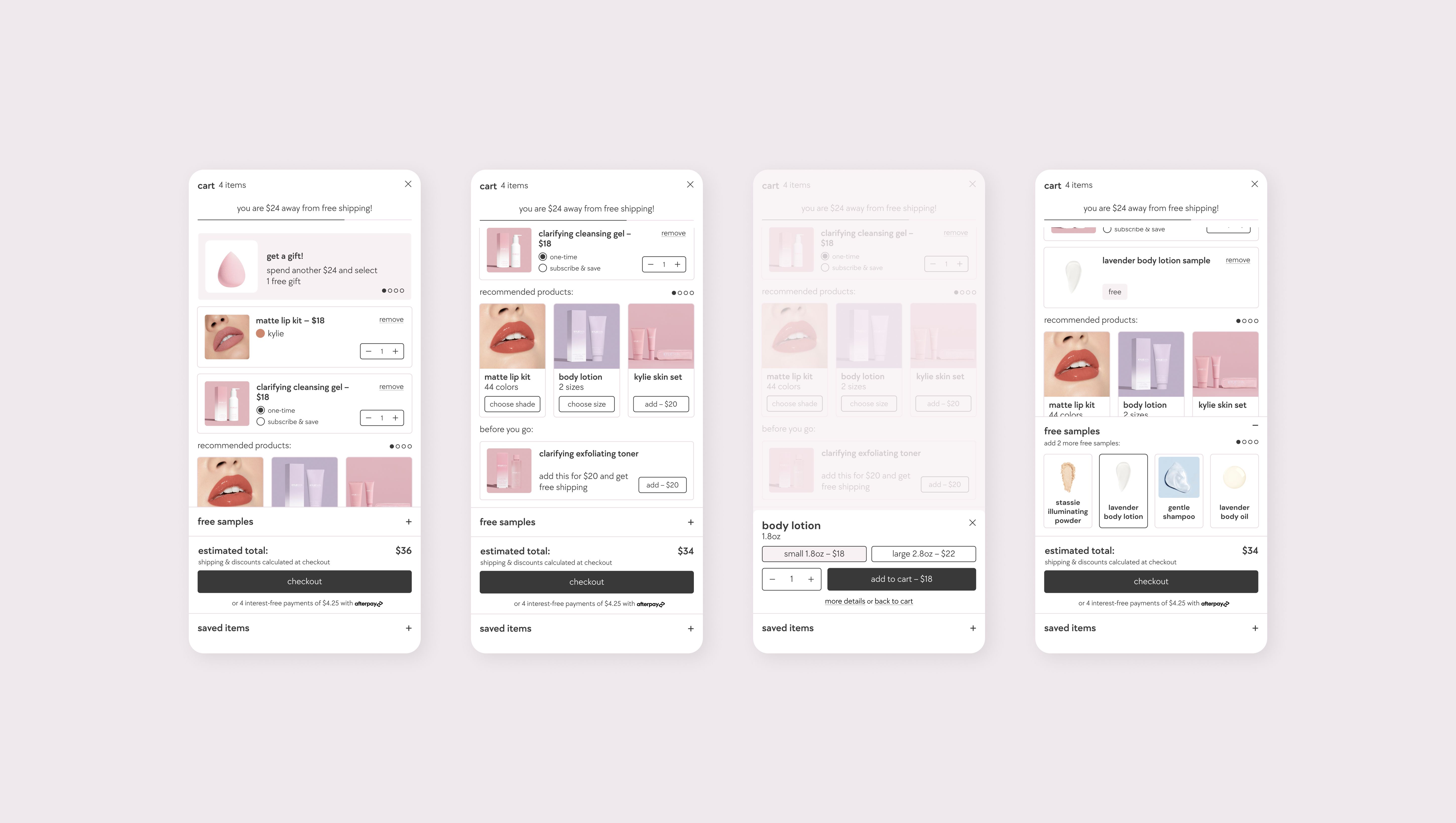
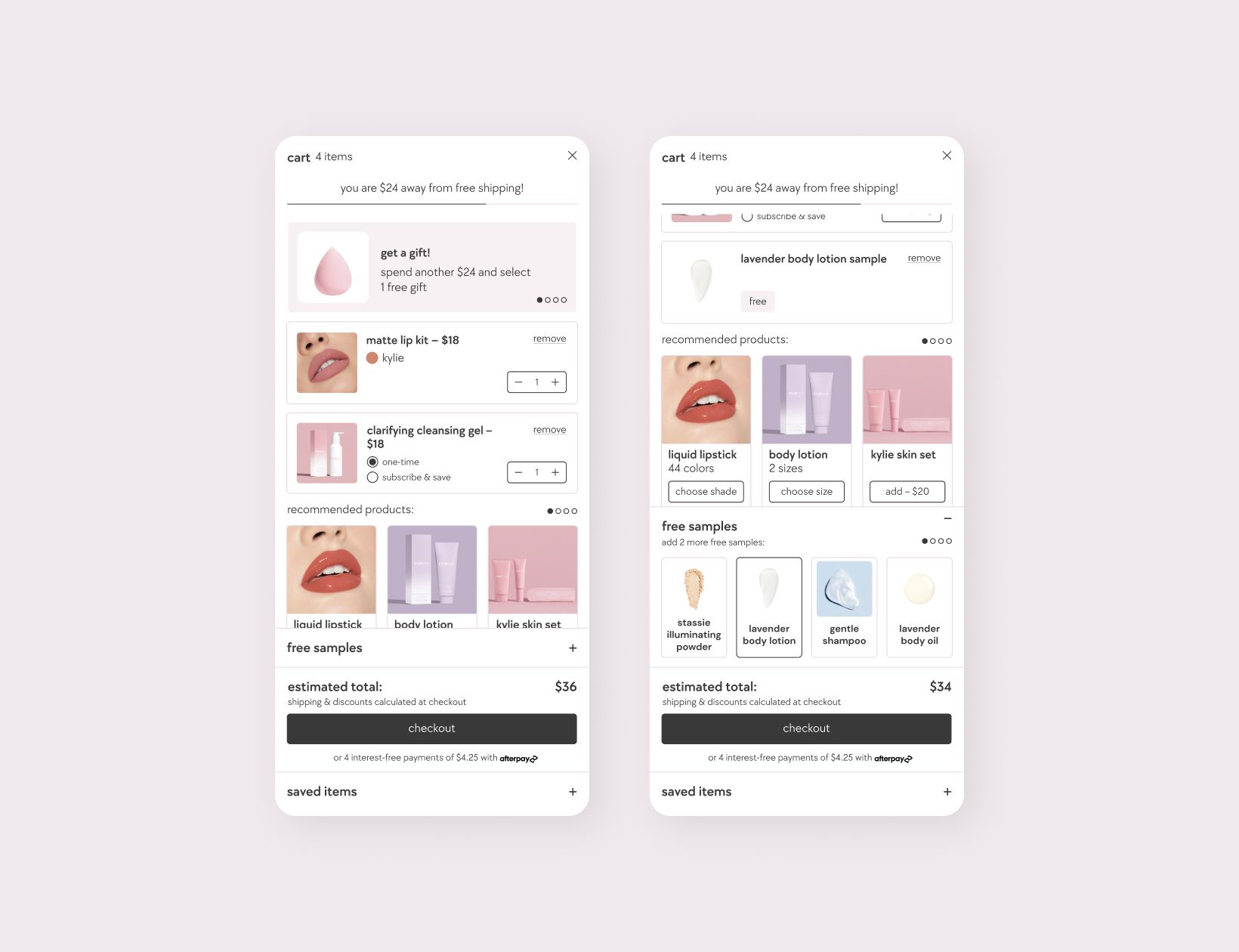
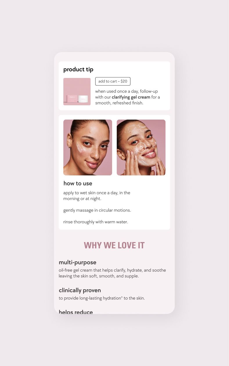
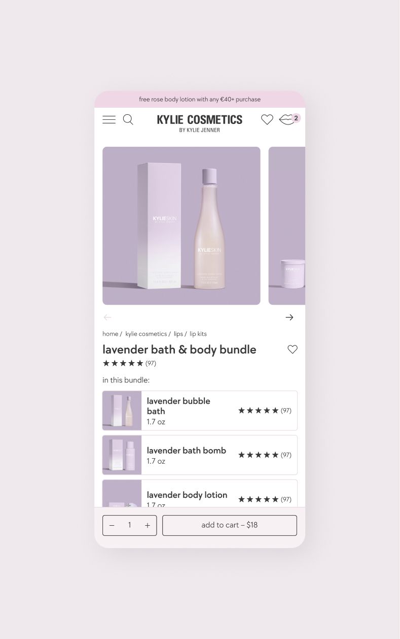
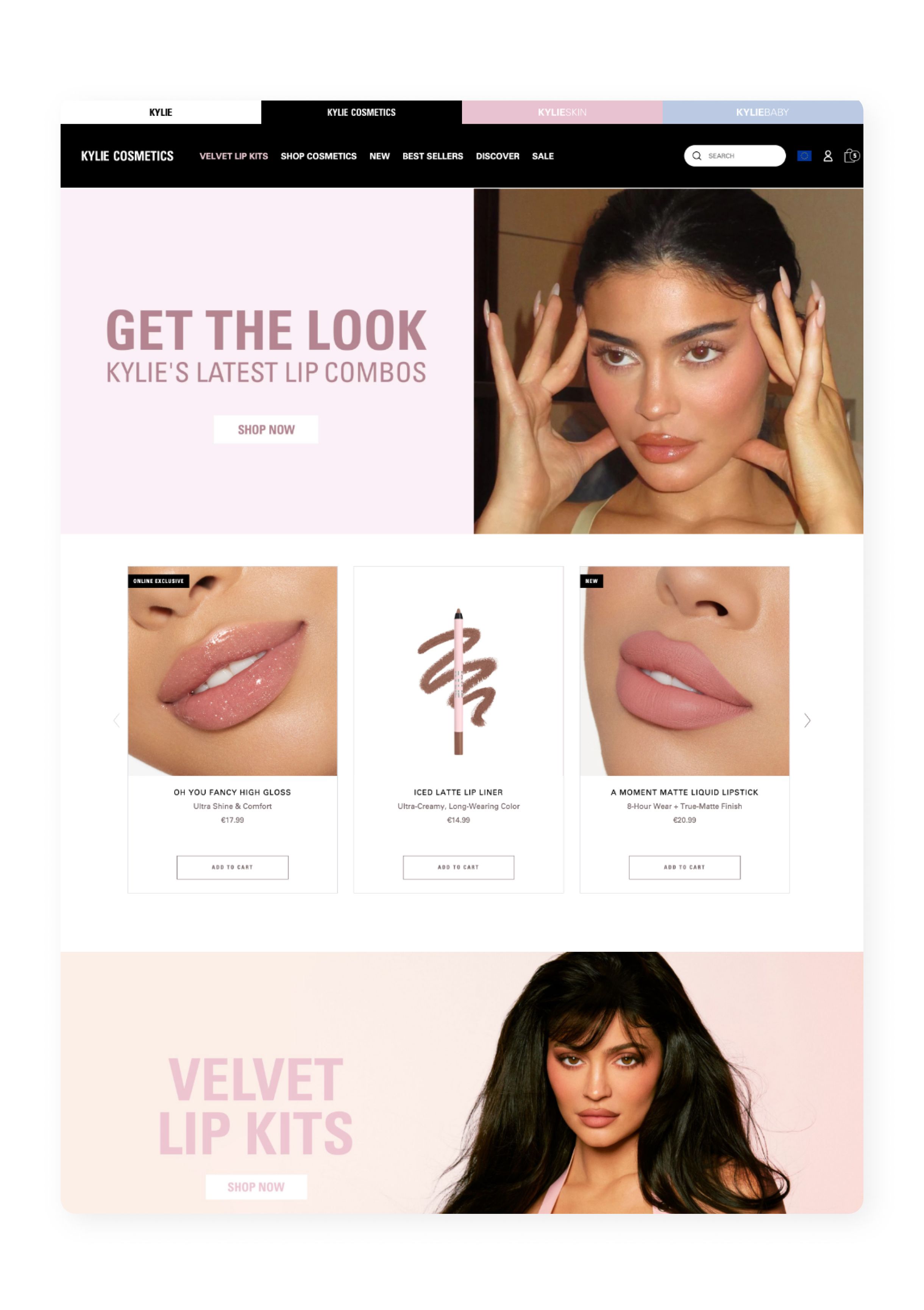
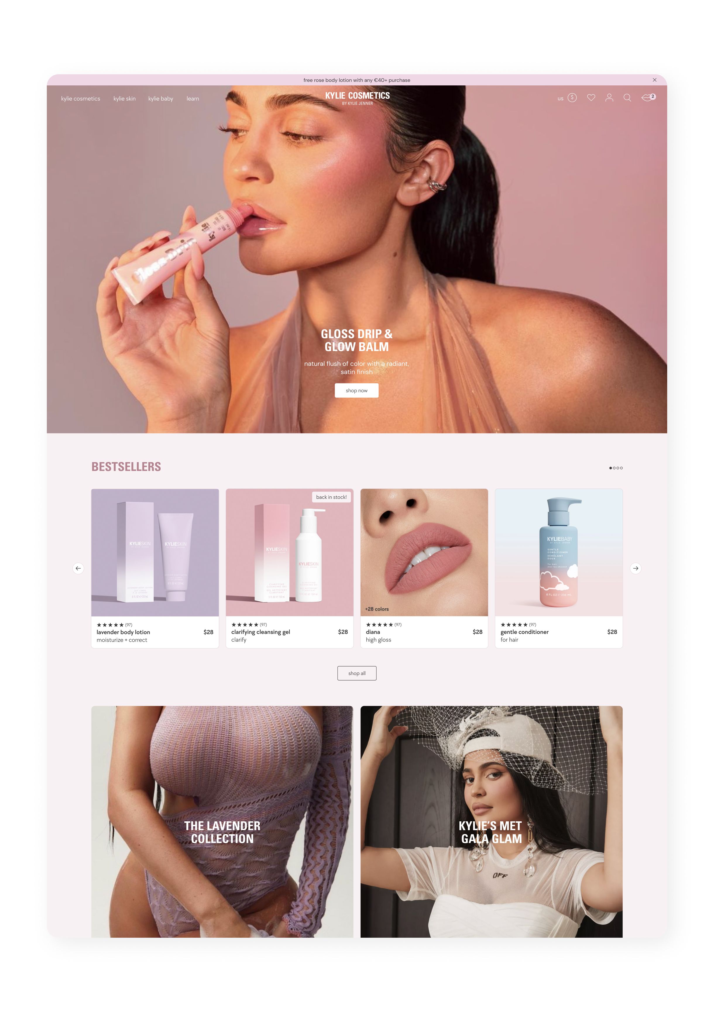
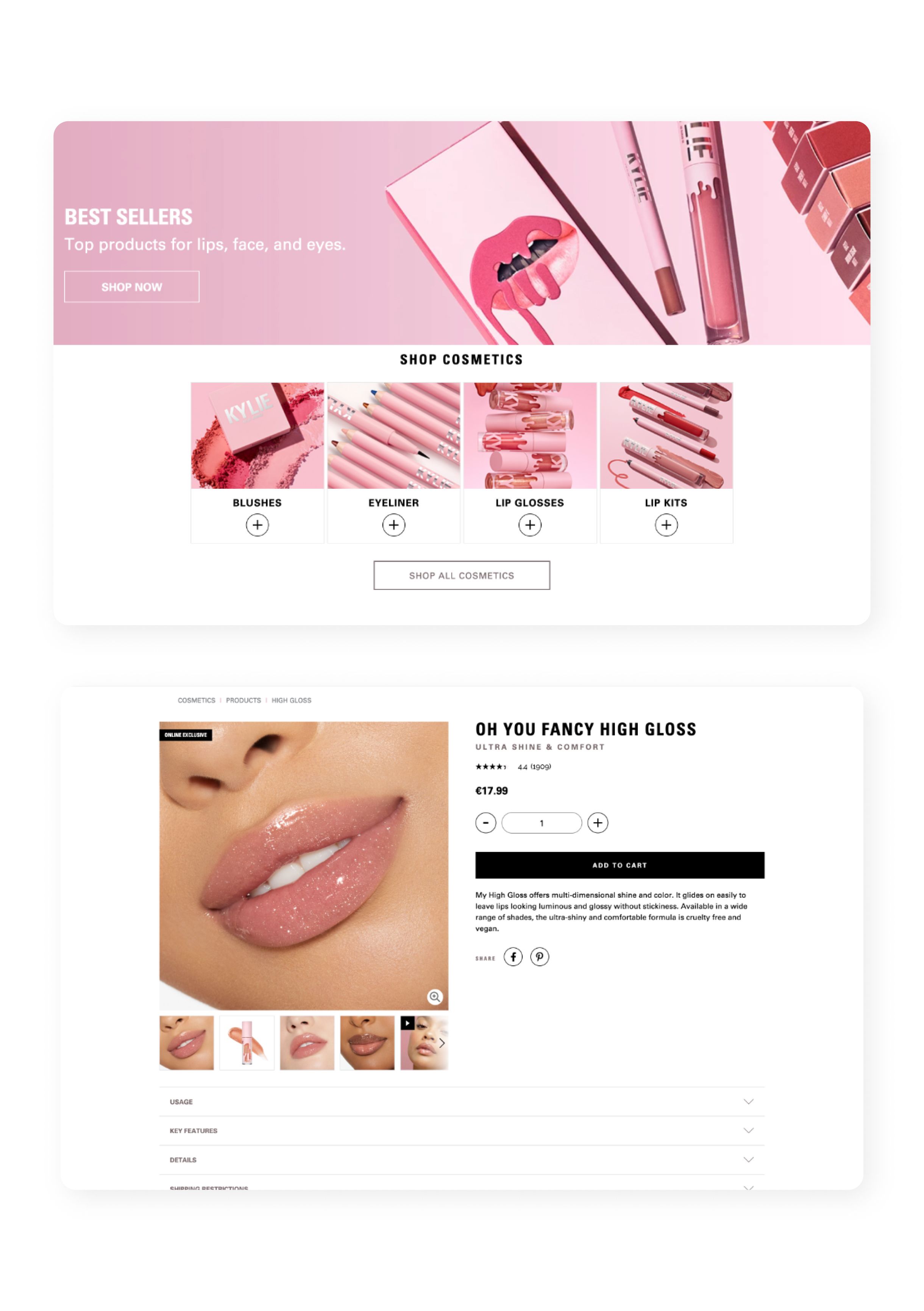
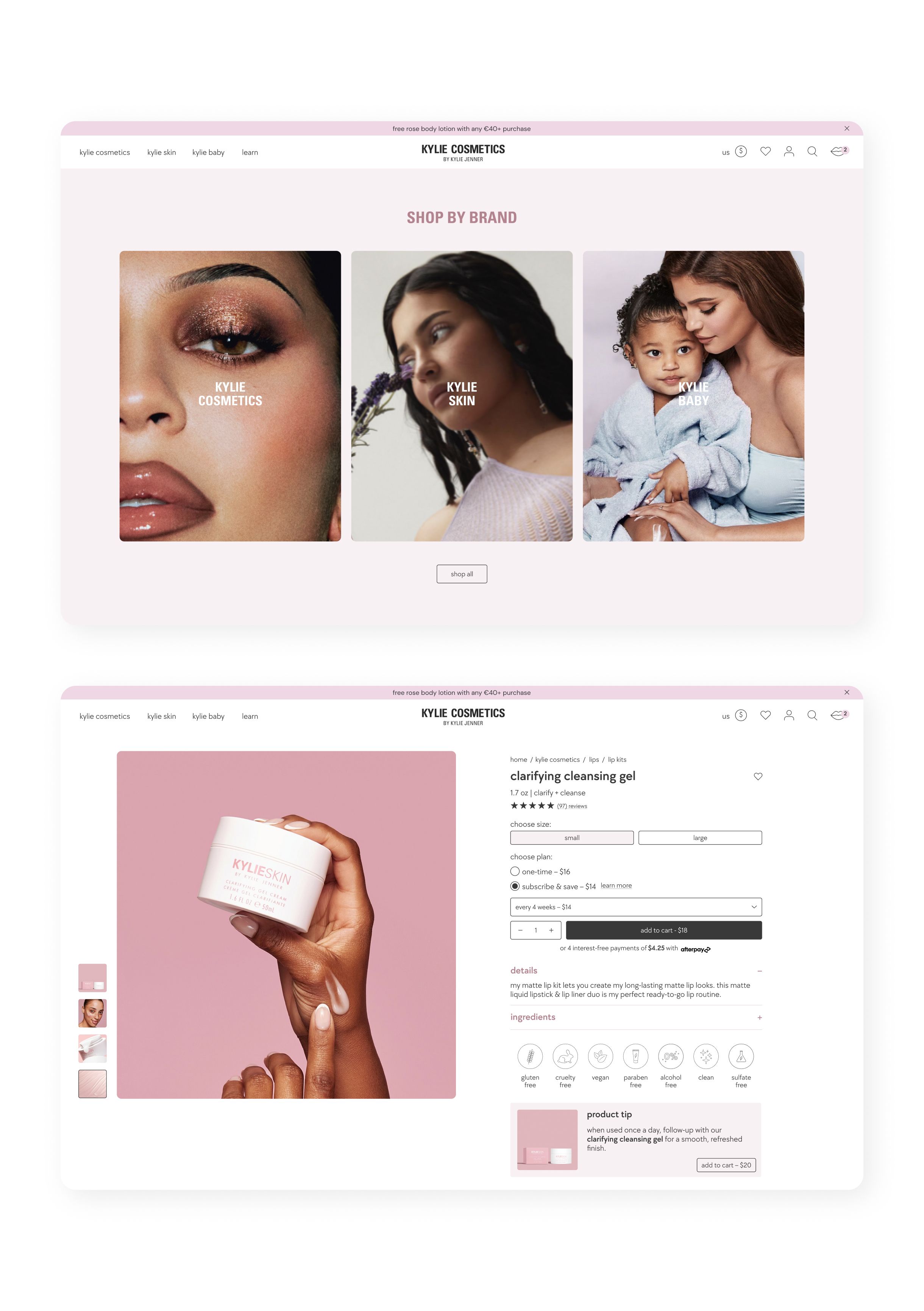
We were approached by Kylie Jenner's team and Coty Inc. to redesign the existing Kylie Cosmetics store. Our role involved optimising the user journey, refreshing the overall design, and creating dynamic elements with reusable modules that are scalable and intuitive.

Drag

One of the significant changes was the complete overhaul of how shopping Kylie's sub-brands worked. We made all brands easily accessible by introducing a global mega menu and cart. This replaced the previous experience that had all three brands separated completely, making it difficult to cross shop.

One of the biggest challenges were the extensive functionality requirements of the mini cart. Utilizing hierarchy of font weights and sizes as well as borders and backgrounds we were able to pack a lot of elements into a small space while still keeping it clear and concise.

We added a quick shop module, making it possible to shop all shades directly from the product listing page. This eliminates the step of having to go to the product page, and therefore makes purchasing faster and easier.

From single products to bundles to "looks" with multiple products, Kylie Cosmetics has it all. It was important to take all instances into account when creating the design and user flows. Multiple products can be added to cart without having to go to each individual product page, making shopping bundles and looks easy and fast. Single product pages feature dynamic content modules that can be utilized on a per product basis.

These images show the old design in comparison to the new design. We redesignd existing elements and made improvements to user flows and information hierarchy, ensuring a seamless and intuitive user journey. The new website has a unified experience for all brands making it really easy to cross shop and access all of Kylie's products.

In redesigning the website we also expanded the branding by introducing a complementary font to the existing brand font. We added to the color palette, incorporating colors derived from the original branding, and introduced new visual elements such as icons to enrich the visual identity. These additions add a refreshing take and much needed variety to the overall brand aesthetic.

Stack

Figma

Adobe Illustrator

Notion

Credits

Rebecca Russell

Design

Consulting

Management

We use cookies so that you have a better experience, you can read more in our cookie policy.