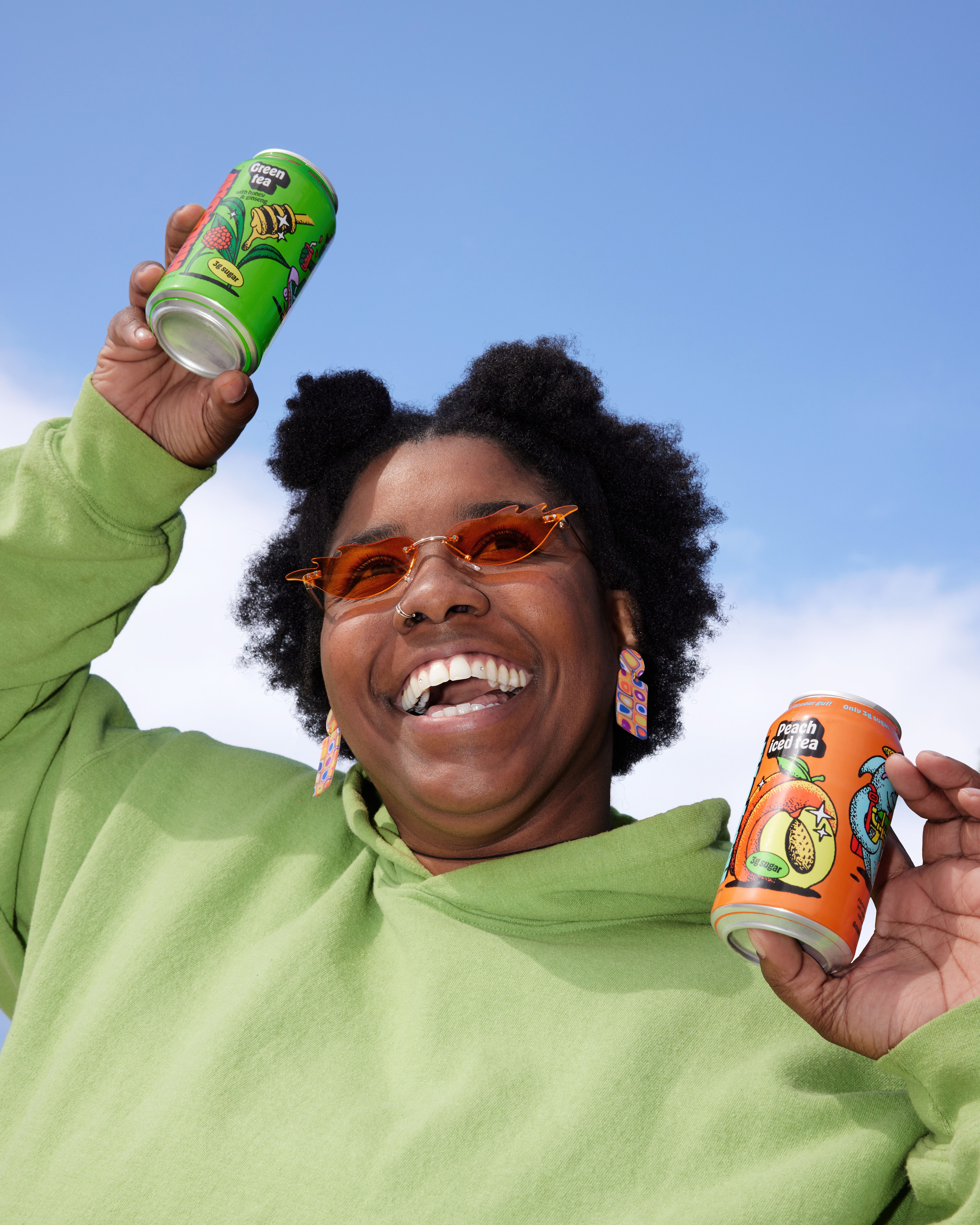
Halfday Tonics

Design
Development

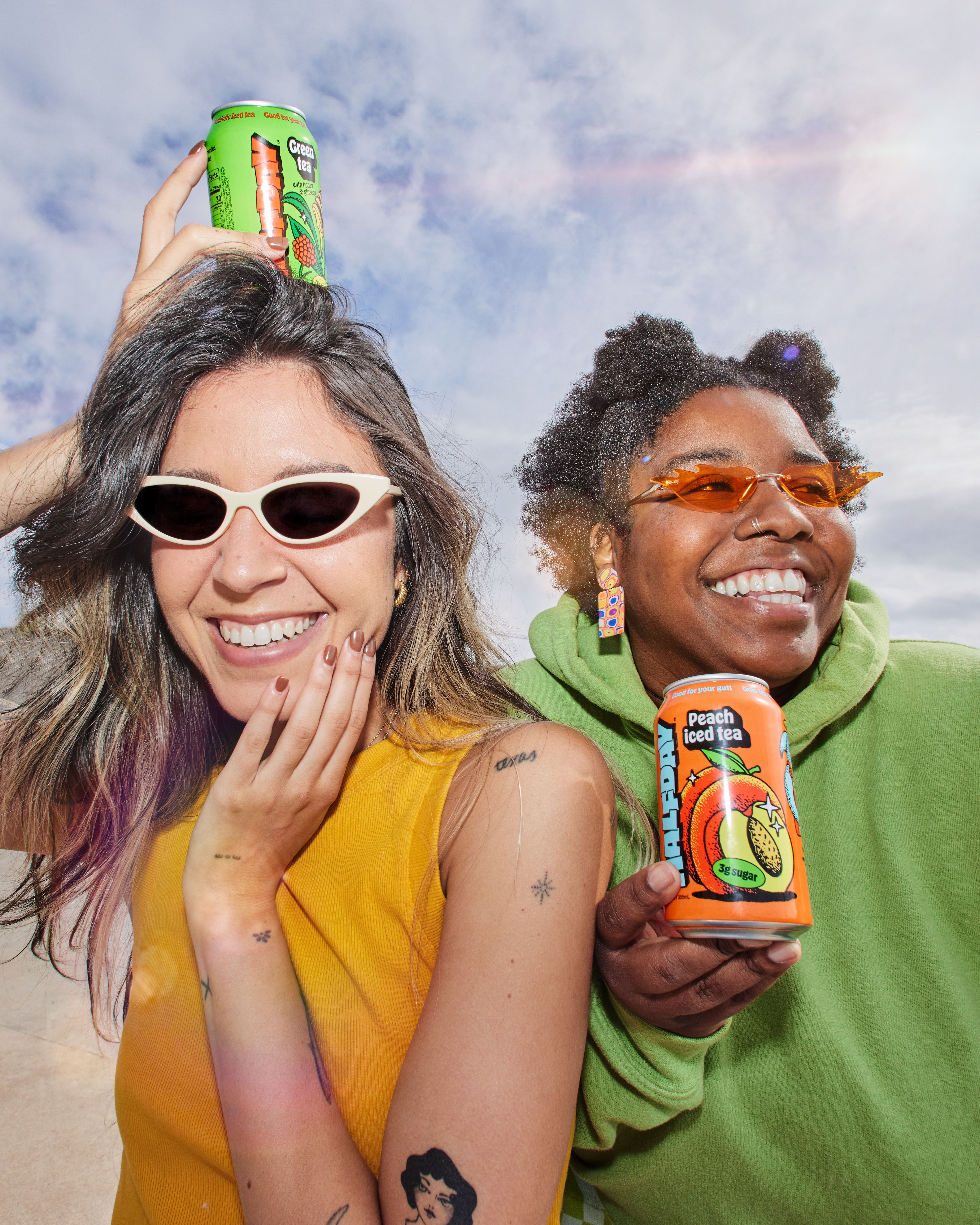
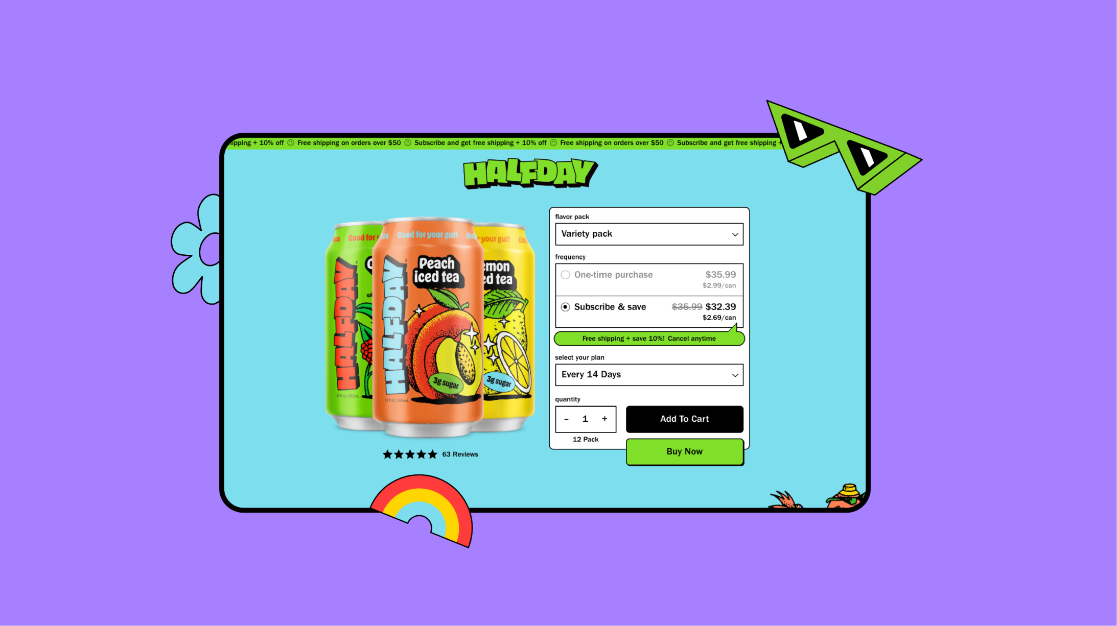
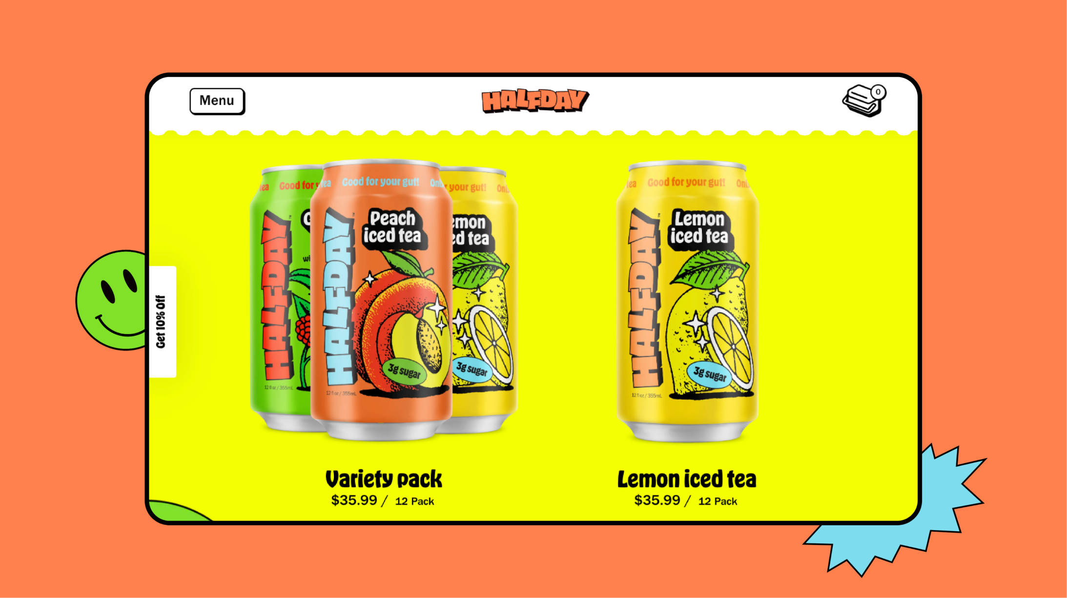
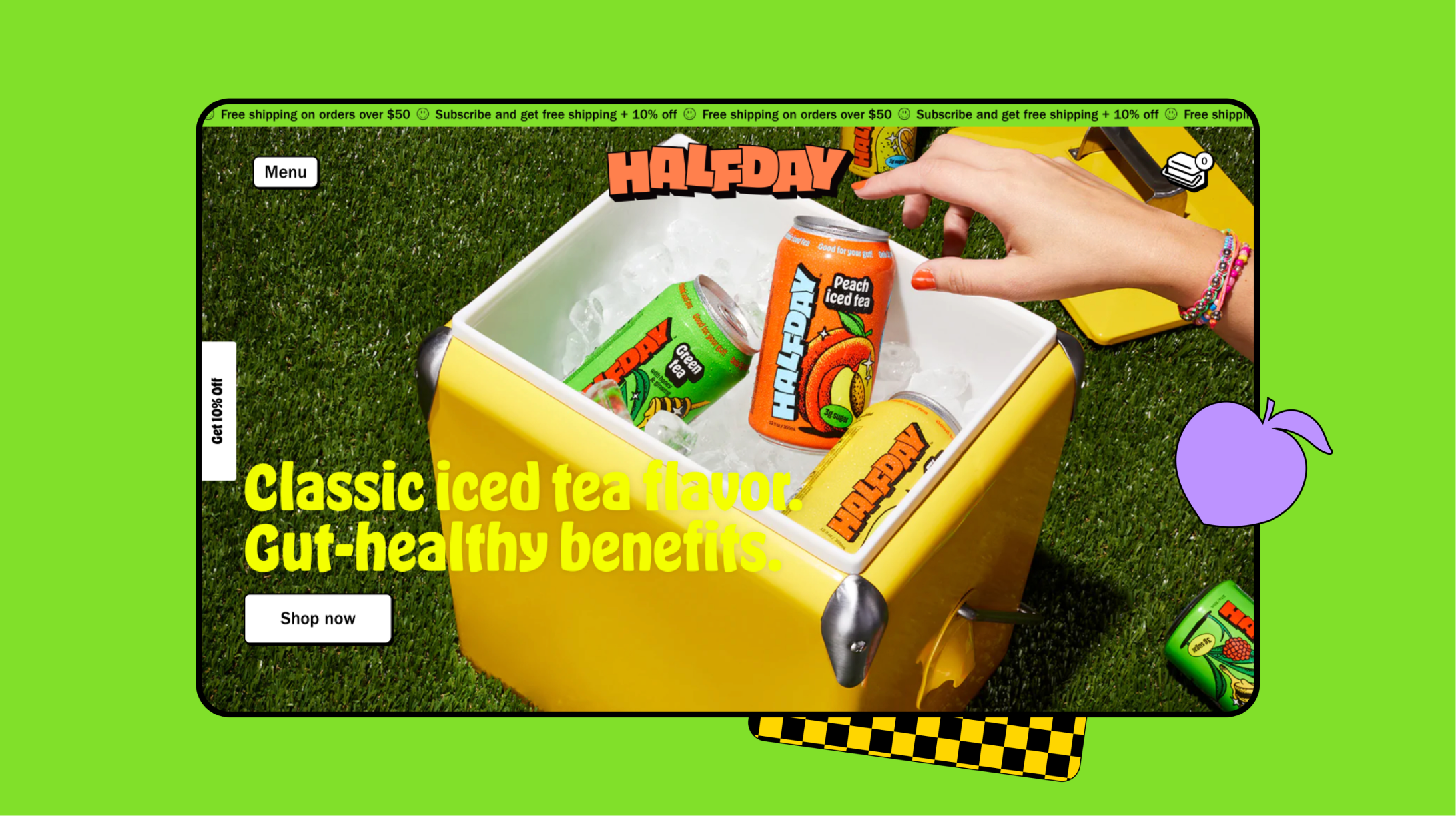
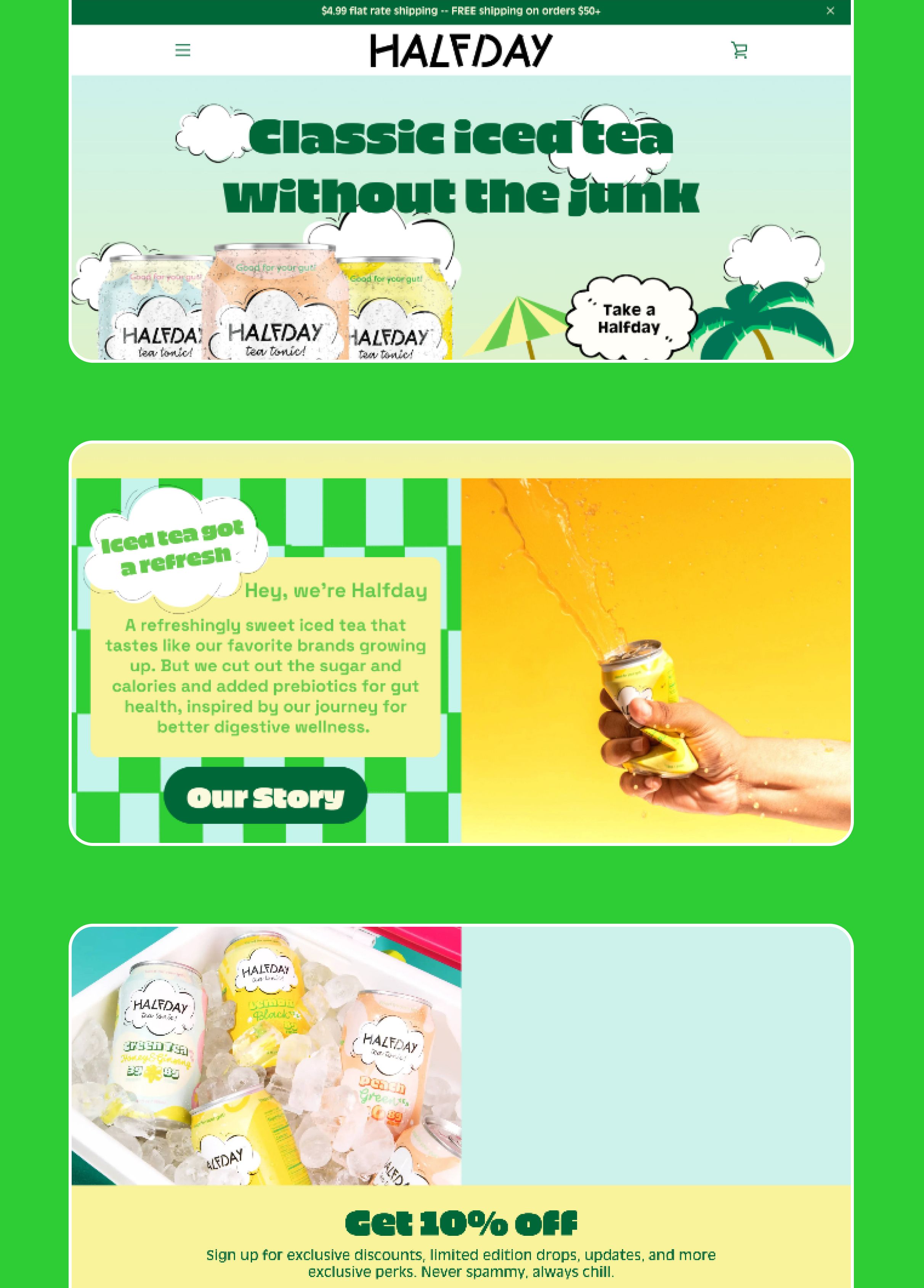
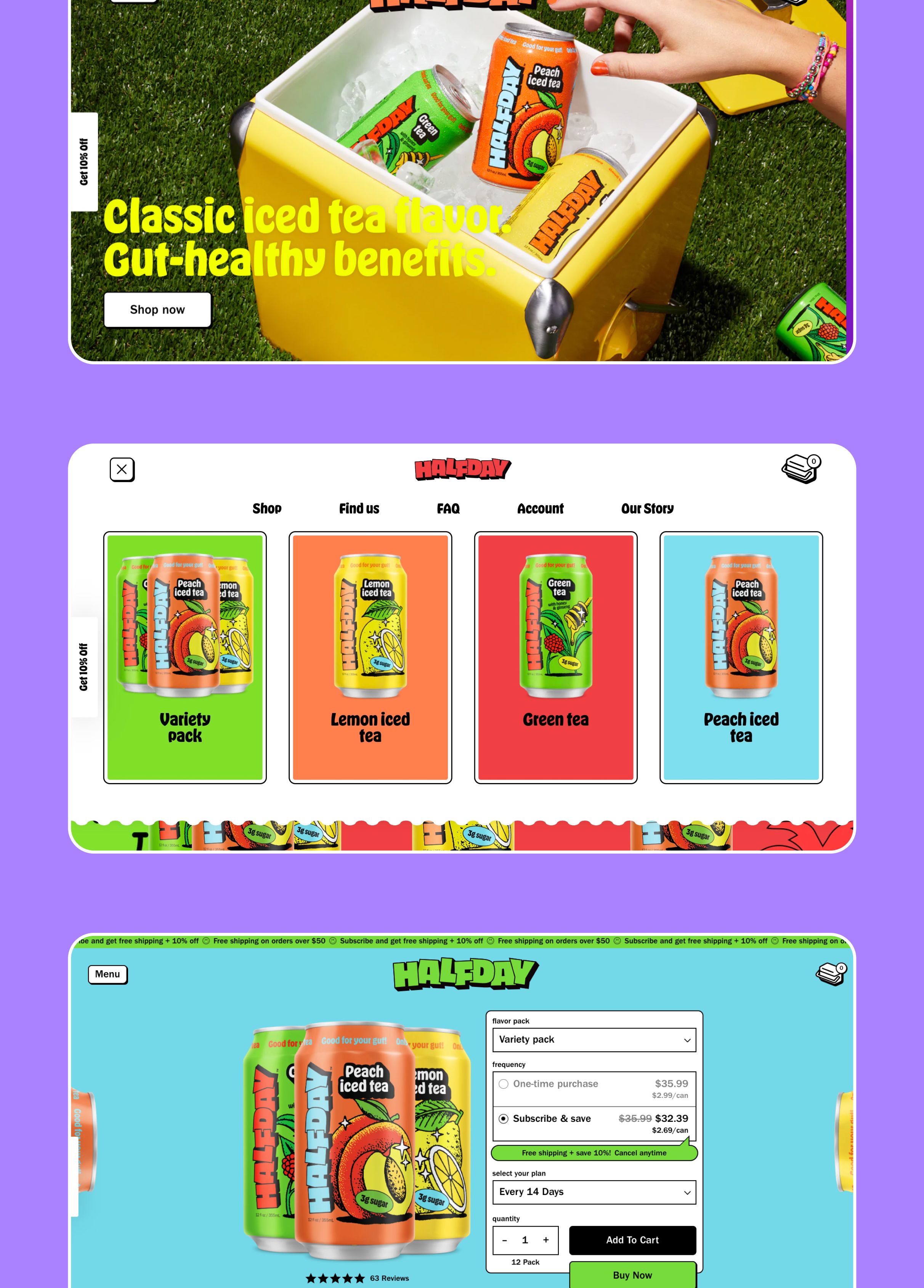
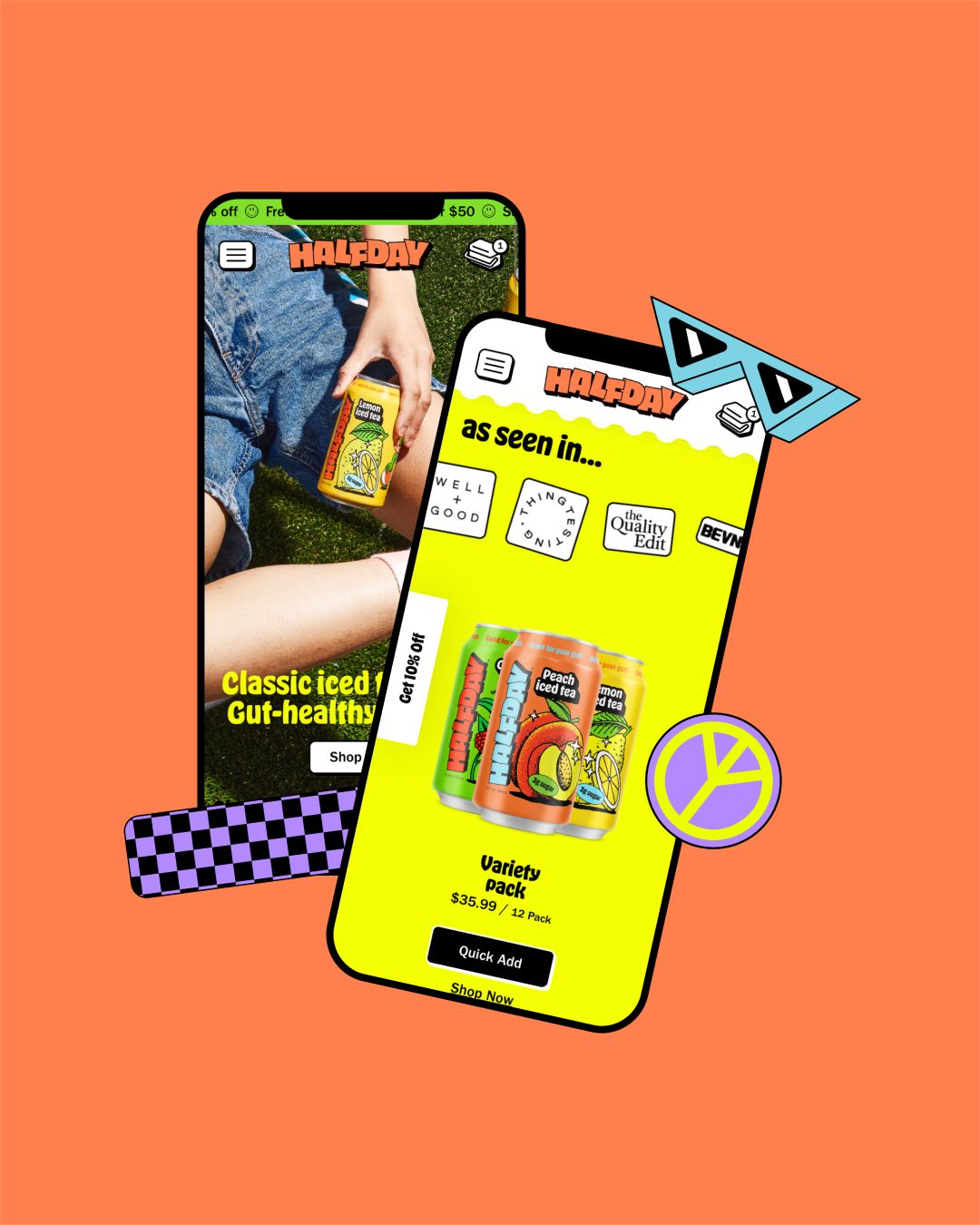
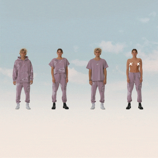
As a brand with primarily retail sales Halfday wanted a website that represented their new branding, and that translates their young and nostalgic aesthetic into a digital experience.

Drag

test
Testing alt

In order to translate the new branding into a digital space we incorporated elements from the creative assets provided like stickers and illustrations that work well in an online setting. Creating a fun website without compromising on the user experience was key here.

The website Halfday had at the time they approached us was not bad. It had elements that worked well for their brand language like big typography and illustrations. It needed to be redone because it no longer represented the branding. In addition to the reworked aesthetic we rebuilt the client's user experience as well, making sure editing content was easy and intuitive.

Although the overall look and feel is playful, the product form is intentionally straight forward in comparison. This ensures that users can focus on the necessary information needed to make a purchase, without getting distracted by unnecessary elements.

Inspired by the packaging design concept, each product has it's own color scheme, and the product page is set up so the client can assign color schemes on a per product basis. There is a slider feature, allowing users to easily browse through all the flavours, just like a gallery.

Stickers were strategically incorporated into our design, carefully placed across the page. Their purpose extended beyond being decorative elements, as they played a vital role in establishing a cohesive visual aesthetic. Through their integration, we successfully unified various elements that might have appeared disconnected otherwise.

We utilized the branding and assets provided by Someone & Others to create the fresh new look for Halfday. Their work served as the foundation for our design, allowing us to incorporate playful elements and make the most of the assets.

Stack

Shopify

Figma

Notion

Awards
Credits

Daniel Maslan

Web Design

Development

Rebecca Russell

Management

Creative Direction

Rebecca Balogh

Management

We use cookies so that you have a better experience, you can read more in our cookie policy.