Main Light

Design
Development

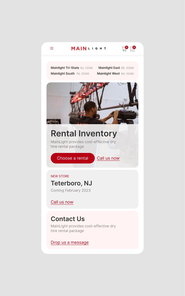
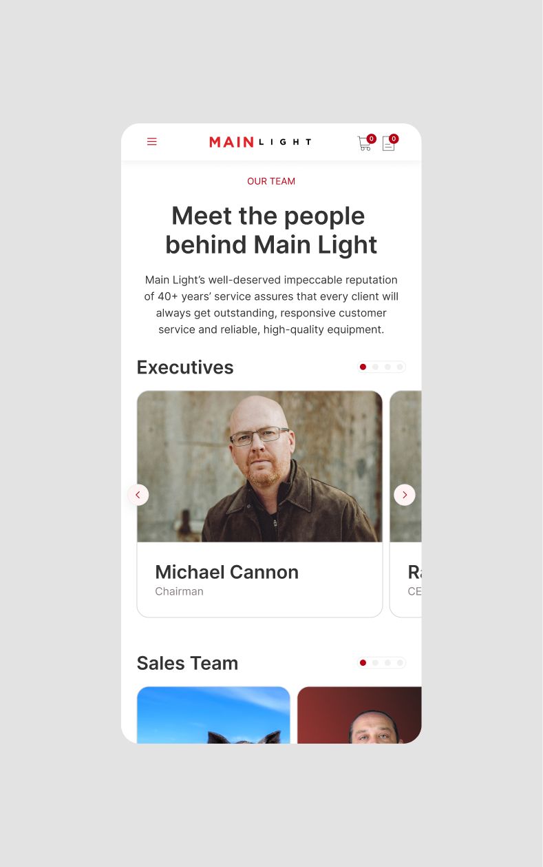
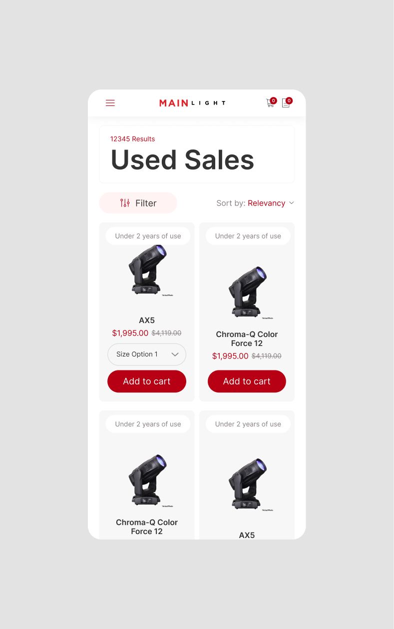
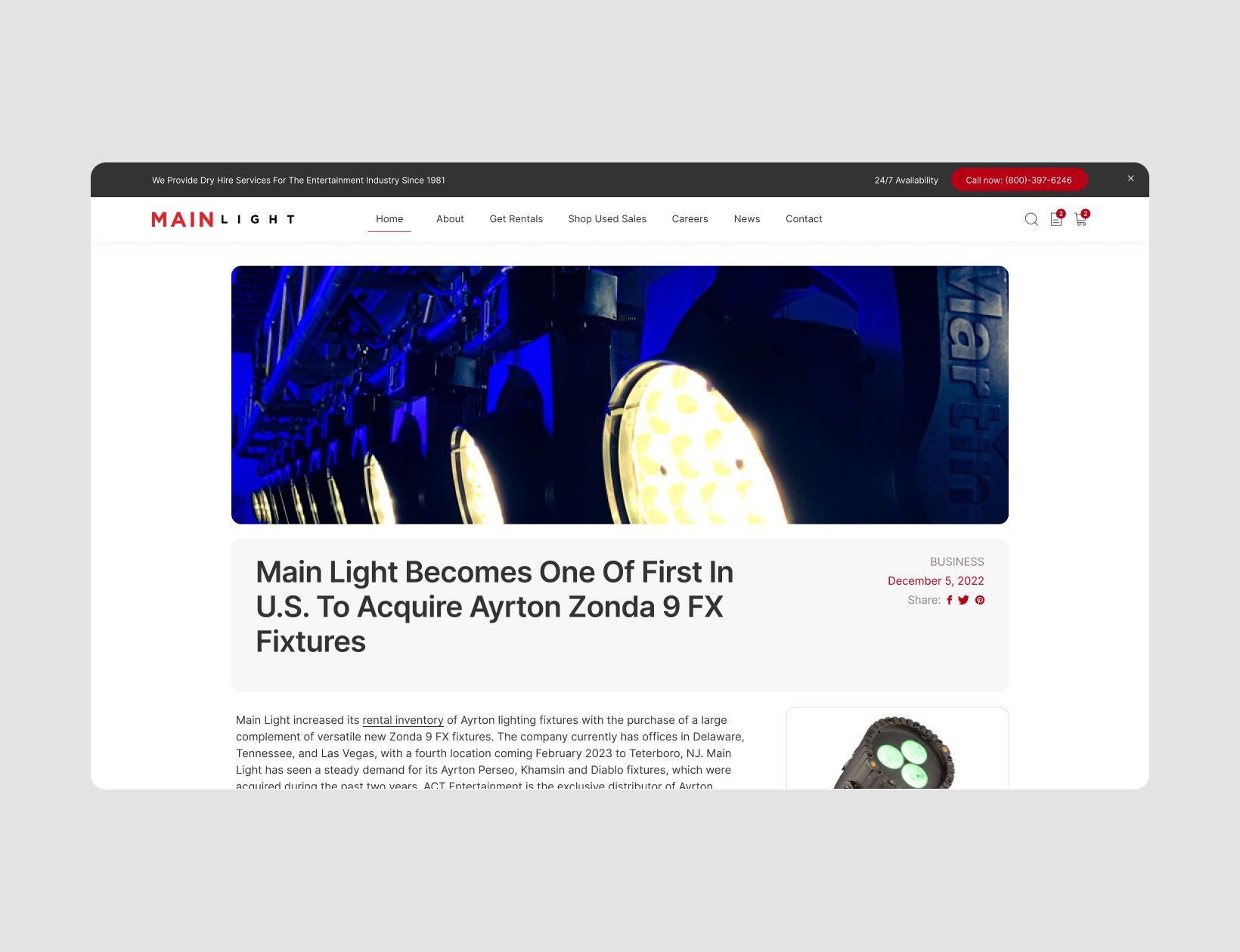
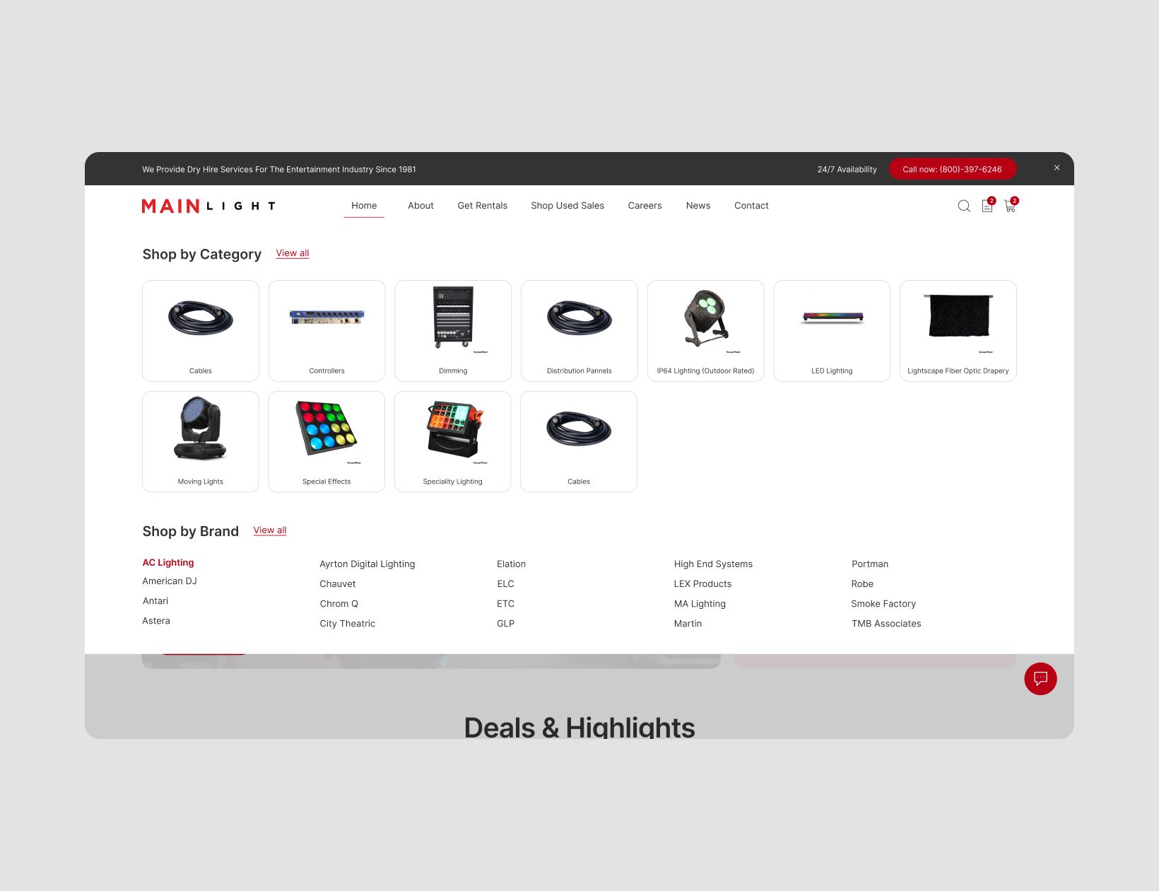
Main Light came to us in 2022 wanting to relaunch their website with a new look and a performance based implementation. In addition to the challenges they faced from an end user perspective they wanted an easy editor experience. With a data driven approach to the UI/UX we paired Sanity with Next.js and connected these to Main Light's custom backend for a seamless solution.

Drag

Data provided by Main Light showed that over 70% of their users were viewing the website from a desktop browser. This meant that although we design mobile first our focus was on making sure the desktop experience is easy and intuitive.

We created a very modular design that gets a lot of information into one viewport without it being overwhelming.

User behaviour data showed that people are not scrolling. This means we had to get creative on how to make sure the information Main Light wants to present is accessible for users that don't scroll.

Horizontal scrollable elements allows for more information to be packed into a smaller viewport.

Two-column product listings means users have to scroll less to see more.

The modular card look works for all types of content throughout the website. Different types of content can be juxtaposed and at the same time differentiated.

By containing content to cards the user has a clear indication of hierarchy and relevance. Which is particularly important on pages with a lot of content like the blog.

In addition to a new design we also improved the overall shopping experience with the addition of a mega menu and advanced filtering on the product listing pages. Users now have access to their cart in the header which had previously only been accessible on certain shop pages.

As a final detail we added micro animations to make scrolling interesting and keep users engaged with the content, while not overwhelming them.

Stack

Figma

Framer Motion

Sanity

Custom Backend

Next.js

React

Vercel

Notion

Credits

Diep My Le

Design

Daniel Maslan

Development

Katharina Chalupsky

Development

Rebecca Balogh

Management

Rebecca Russell

Creative Direction

We use cookies so that you have a better experience, you can read more in our cookie policy.